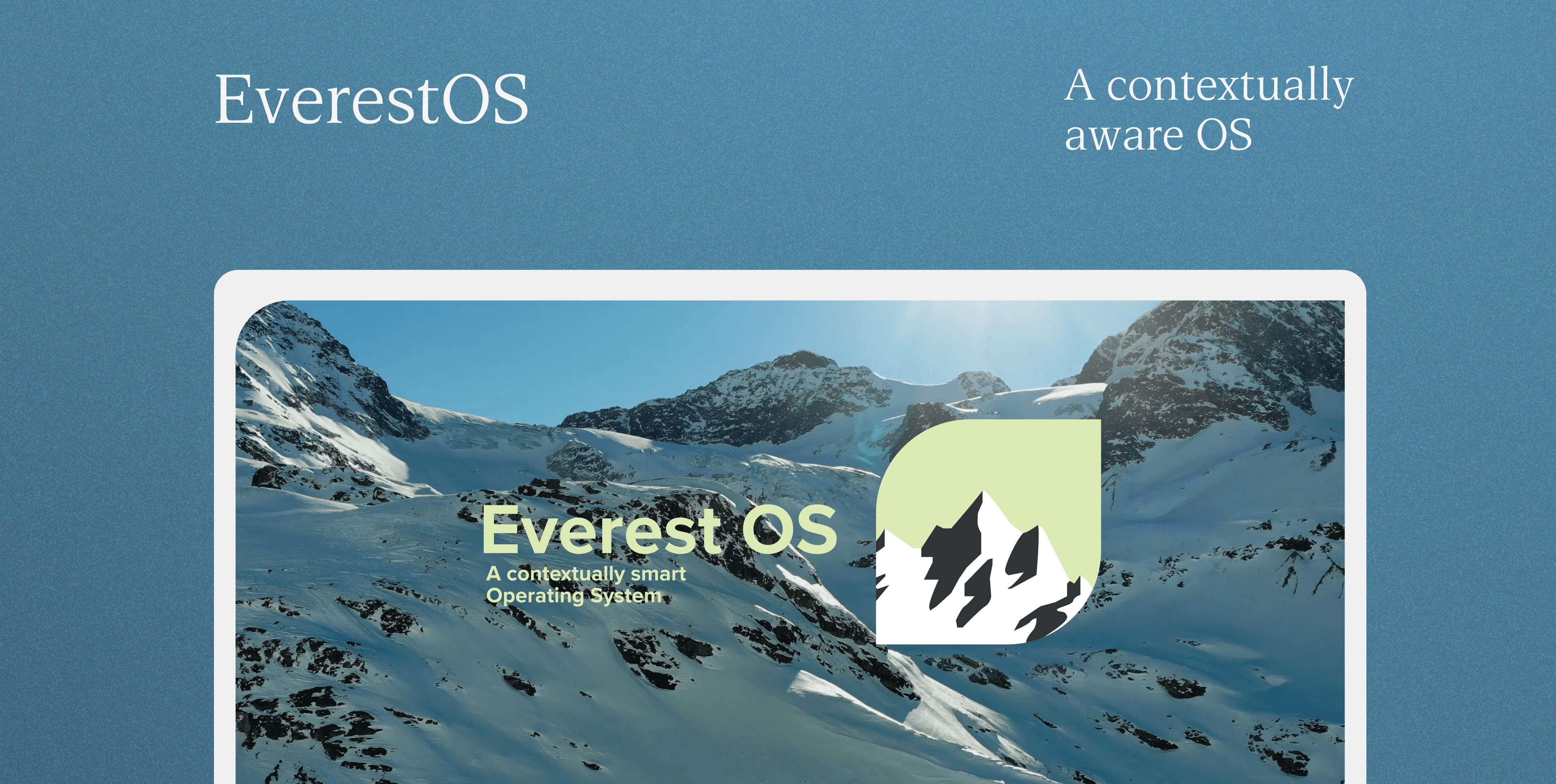
Reimagining operating systems and elevating the Digital Experience.
I always wondered about how people would go about designing an OS. I felt it was an interesting challenge and decided to take up on it in my Advanced visual design class.
Since this was a visual design course project, My key focus was on designing visually appealing screens and interactions. I focused on creating a new OS rather than skinning an existing one.
EverestOS is simply an OS concept. It is in no way a complete OS proposal. It is just a practice project.
How might we develop an operating system that seamlessly blends innovation with tranquility, providing users with a unique and enriching digital experience.
I designed a contextually aware OS whose primary component was the users calendar. I focused on enhancing efficiency, personalizing user interactions, and creating a cohesive and recognizable brand.
Class members - Critics
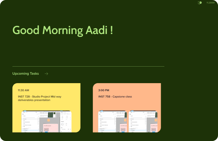
Contextually aware suggestions on lock screen
Daily planning with Rituals
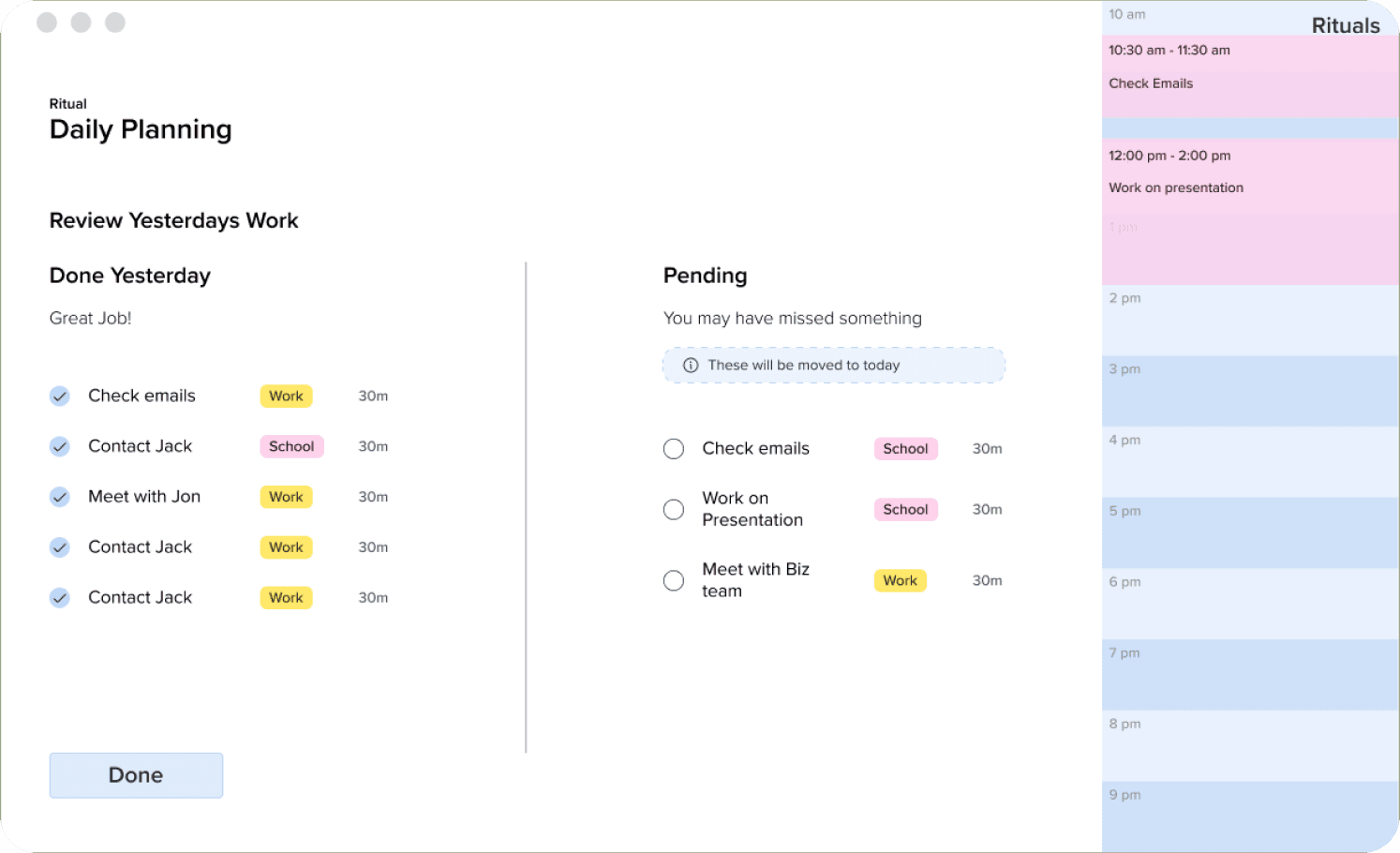
Seamless calendar integration
Simplify your process with smart workflows
Easy clutter less multitasking
Fast access to most used apps
What this project is and what to expect?
My goal with this project was to practice my visual design, interaction design and prototyping skills. I conducted user research and a usability testing session.
01
Personal Project
This is a personal project to develop and improve my skills. There are no metrics or outcomes beyond my personal growth.
02
Practicing visual and interaction design
I focused on high visual polish, consistency, building a design system and a design language for this project.
03
Trying new things
I also wanted to work on this project to try new things and expand my creative potential.
Understanding the evolution of OS
First step was to get an understanding of how the current OS were designed and how they have evolved.
1950s - 1960s
No real operating systems; computers were typically programmed directly in machine code or assembly language.
1960s - 1970s
I focused on high visual polish, consistency, building a design system and a design language for this project.
1970s - 1980s
The first graphical user interfaces (GUIs) emerged.
Apple's Lisa (1983) and Macintosh (1984) introduced the desktop metaphor with icons and a mouse.
Microsoft's Windows 1.0 (1985) had a simple GUI, but it was not widely adopted.
1980s - 1990s
Macintosh System Software evolved with each release, refining the visual design.
Windows 3.0 (1990) introduced a more Windows-like GUI and started gaining popularity.
1990s - 2010s
Windows Vista (2007) introduced the Aero visual style with translucent elements.
Windows 7 (2009) refined Aero and became a widely praised OS visually.
macOS introduced various visual themes, including Leopard, Snow Leopard, and Yosemite.
Mobile operating systems like iOS and Android brought touch-friendly interfaces.
2010s - present
Windows 8 (2012) introduced a touch-centric Metro UI but received mixed reviews.
Windows 10 (2015) combined elements of Windows 7 and 8 for a more cohesive look.
macOS continued with visual updates like Mojave's Dark Mode (2018).
Mobile OSes continued to evolve with iOS, Android, and the introduction of gesture-based navigation.
Flat design and minimalism became popular across platforms.
How AI can change the OS?
I felt that OS have not changed a lot since inception, while the supporting hardware has changed a lot. Now especially with the onset of AI, I wanted to reimagine how an OS would look while integrating key AI capabilities. Here are some possibilities I evaluated-
01
Personalization
02
Natural Language Interaction
03
Contextual awareness
04
Cross-Platform Integration
05
Adaptive Workflows
06
Proactive assistance
Finding visual insipiration
I have always loved hiking in the Himalayas. I feel that hiking is very similar to everyday life with some extreme challenges. I got inspired by my own experience for this. My aim was to capture the calm yet adventerous nature of the mountains
EverestOS is inspired by a hikers experience on one of the most beautiful places on this world - The Himalayas
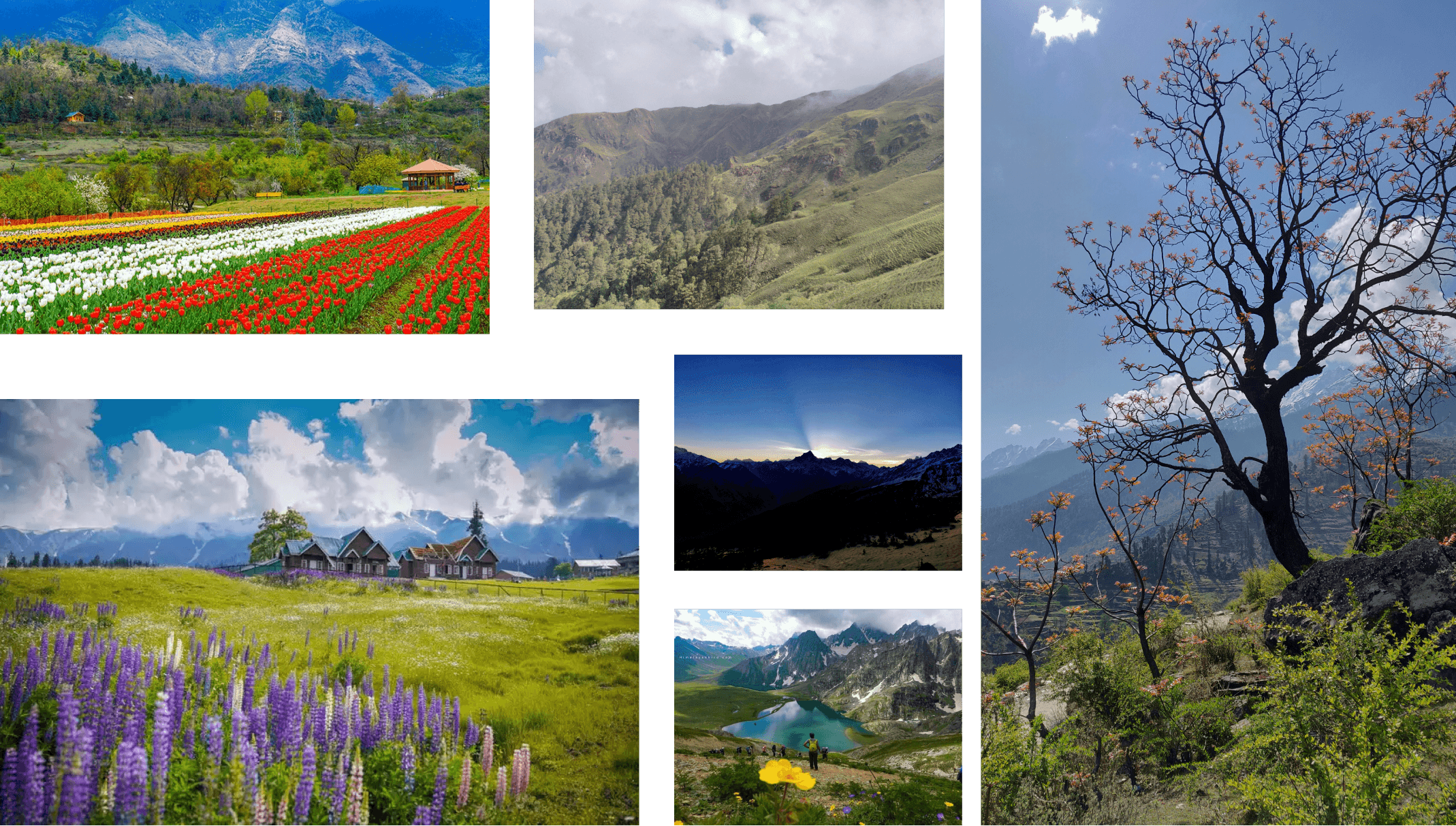
Building out the branding. Color
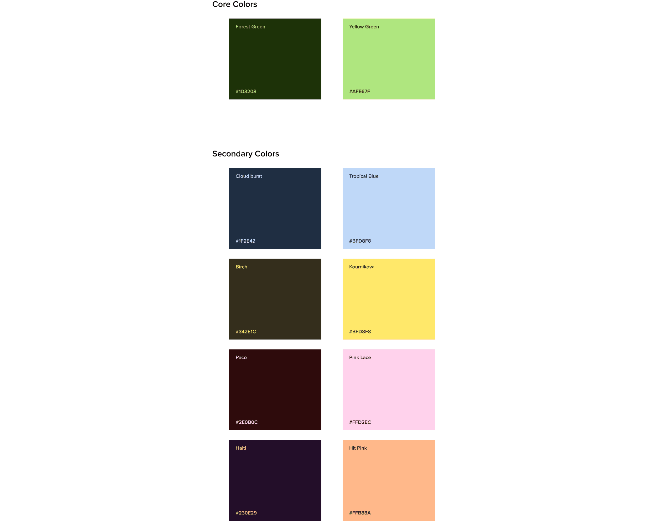
I started out by defining the color scheme. I picked up colors from what you would see in the Himalayas. I loved how in a sea of flowers or a bed of trees, a single more contrasty flower or tree popped out and I used that as my inspiration.
Typography
I decided to go with a single font - Proxima Nova. Its clean and modern appearance aligns with the sleek and contemporary aesthetic of the modern gears and equipment that hikers may use during their journey.

Designing the Logo
I wanted the logo to capture the essence of the Himalayas while portraying the peak of productivity. What better than to use Mt Everest itself!

Defining the Brand Identity
I then created an extensive branding document complete with the brands vision, mission and rules for color, type usage .
Designing the OS screens
The OS screens needed to be unique and something never seen before. I started out with simple paper sketches and low fidelity prototypes.
Reflecting on the project outcomes
I was able to successfully come up with a design for the OS. Although the design is not comprehensive enough it was a very interesting project to work on. This is still a work in progress and there is a lot of work that needs to be done.
01
Branding as a Design Element
Recognizing the role of branding as an integral part of the design process is crucial. Consistency in visual elements, from color schemes to typography, is a powerful tool in creating a cohesive and recognizable brand identity.
02
Harmonizing Innovation and User Experience
Understanding how to seamlessly integrate cutting-edge features with a tranquil user experience is a critical skill. This project highlighted the importance of not only introducing innovations but ensuring they enhance, rather than disrupt, the overall user journey.

